When I started Project 365 last year I quickly determined after posting my shot of the day, that I would delete all the superfluous "contenders". A few weeks later I ran into situations when I could not decide which photo to choose, so I (thankfully) saved the extra pics to work on for a rainy day. Now that I am no longer immersed in getting a photo every single day, I have the time to go back and look at some of those extras. Here are the ones that got saved:
Reject of 1/6/10
Since the weather has been so uncooperative lately, I got the idea of going through my rejects of last year's Project 365. Edited in Photoshop using Pioneer Woman's "define and sharpen" action. Added a texture called
Page 189 by Joessistah. I think I'll keep it now!
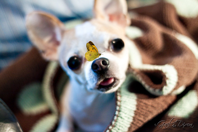
Reject of 2/17/10
Loved Izzy's expression here but wasn't happy with anything else about it. Ran PW's 'define and sharpen" and "slight lighten" actions, then added one of
Joessistah's butterflies. Just having fun! Now that the pressure is off 365, I can do that. :)
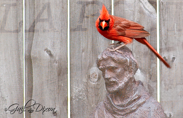
Reject of 8/6/10
I had been waiting all summer for the male cardinal to perch on top of St. Francis' head. Finally I got my wish but he didn't stay long. Afterwards, I decided I didn't like the photos for my project, but still, I could not delete them...just in case. Initially, I rejected this shot because the cardinal's tail had some motion blur and the photo was too dark. Pulled it into Photoshop and slapped on this "LA Post" gray texture which lightened up the photo considerably. I erased the texture from the bird to make him "pop" and I think I like it now. :) Sorry, I do not know the origin of this texture.
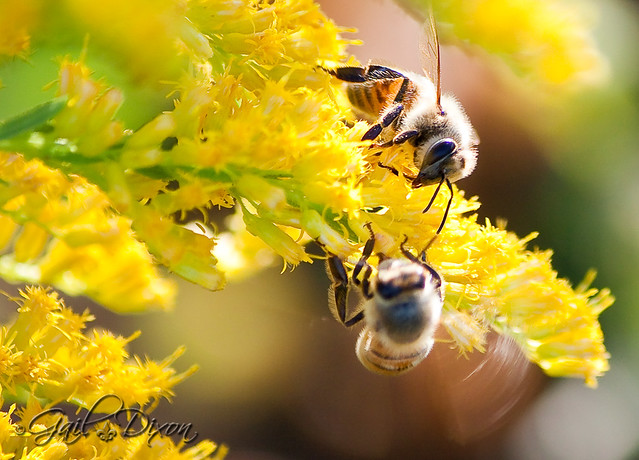
Reject of 10/6/10
At the time I didn't like the bottom bee because he is out of focus; however, i just noticed tonight the blur of his wings which actually looks kinda cool.
Reject of 10/7/10
Shooting dragonflies/damselflies is difficult for me. The biggest problem is the reflections in their bulbous eyes. I think I rejected this one because of that and because his wing is tattered. But I loved his turquoise blue face and couldn't delete him for that reason. Shouldn't we be like that with people? We shouldn't write off someone because of a perceived flaw; everyone has them, and with a little effort, you might just uncover a hidden gem.
Reject of 10/8/10
I took about 20 shots of this egret as he grabbed a fish right out of the water. This is cropped to show more detail. Hard to believe, but as recently as October I did not know how to sharpen properly in Photoshop or Lightroom. Not that I know my stuff now, as I'm displeased with the reddish outline that resulted after I sharpened. If anyone knows how to fix this, I would be grateful. :)


9 comments:
Gail, I think looking at our pics is like shopping. One day I wouldn't dare spend $ on something, and the next I'd buy it w/o batting an eyelash!
Your rejects are truly first class! Glad you didn't hit the delete button!
Gail, your rejects are AWESOME. I so love your little guy with the butterfly on his nose. Adorable! :)
Being a perfectionist is hard, but your work is impeccable.
Have a blessed week!
Thanks, Lisa and Betty! I appreciate y'all.
Gail, I hope that someday my CHOSEN photos will be as good as your rejects!!
Keeping in mind I have NO idea of what I'm doing in PSE, the first thoughts that came to mind on the red outline on the egret was that the white balance hint remained when sharpening. I don't know.....All I know is that when I do my histogram editing, I use the white balance hint to know when I've gone too far in the exposure, then I have to use the recovery to bring some of it back.
Like I said....I have NO idea what the heck I'm doing (still have to use my "notes" from an online class
Someday I'm going to figure out how to add these textures....
Starla, you are too kind. Thanks for the hint. I will look into the white balance issue. I think you're onto something! :)
Your rejects are wonderful Gail, and I am so glad you decided to post them!
Gail, to me, I wouldn't consider any of these pictures as "rejects," I love them all!
I LOVE your rejects. Congrats on being a finalist over at PW's!! (Again. :))
Lisa, Nadine & Hula, thank you for stopping by! And I appreciate the nice comments. Hula, I didn't win (again) but that's okay; it's fun being chosen. :)
Post a Comment